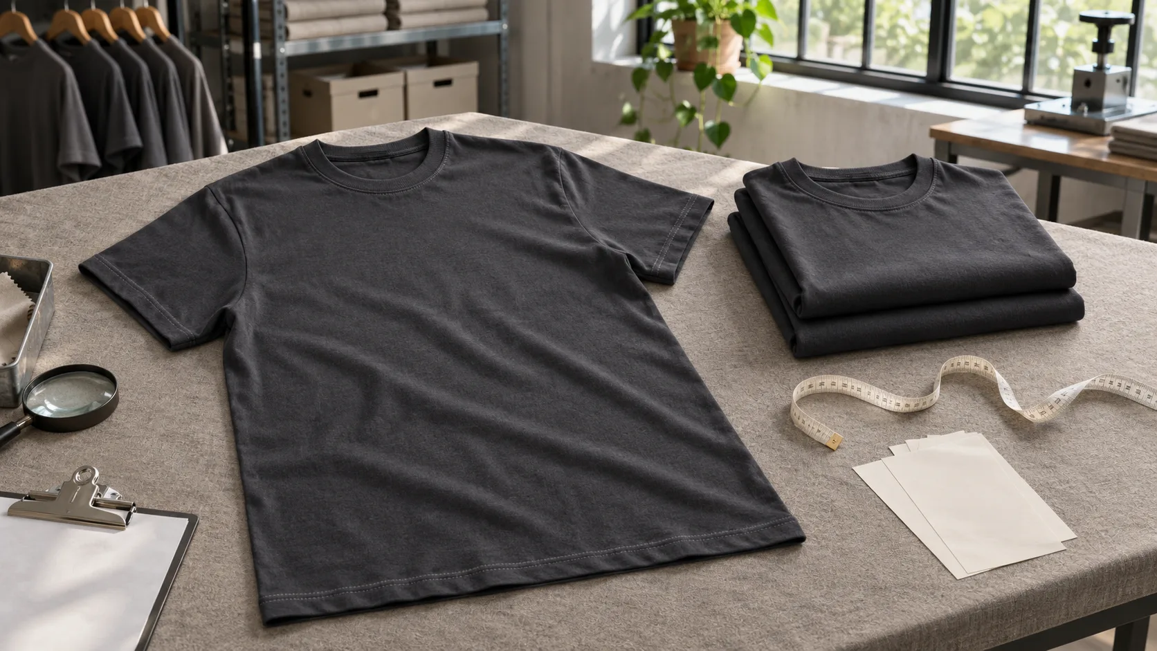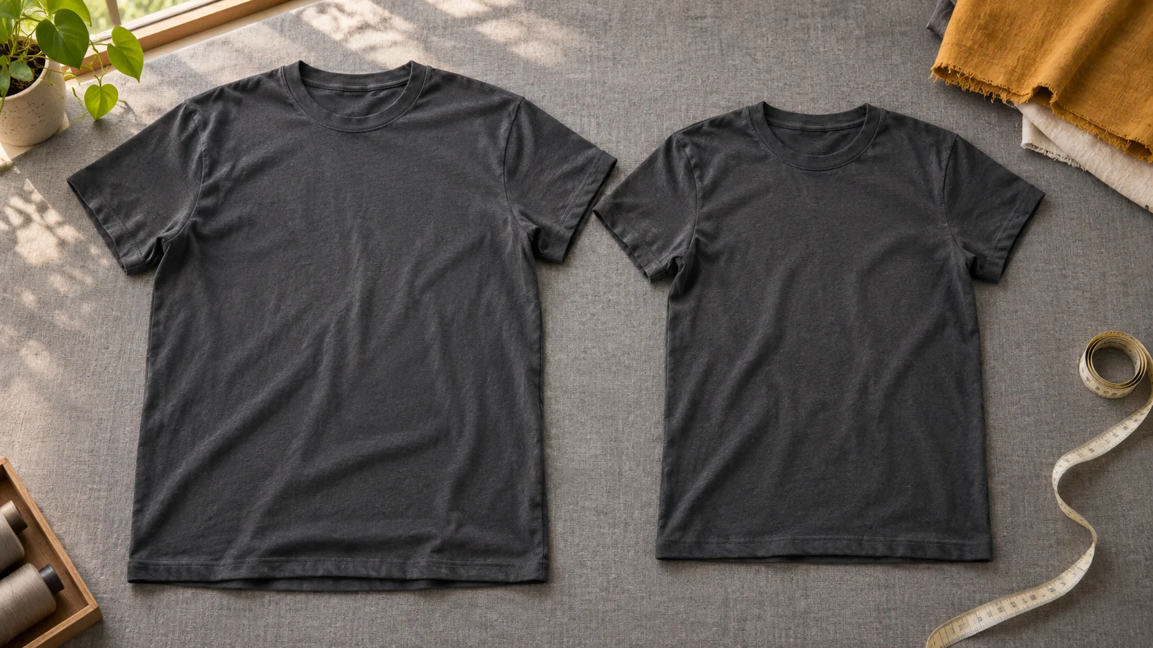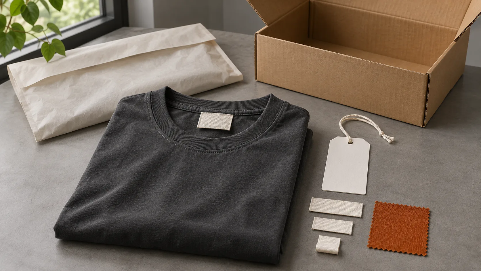
A neck label can look sharp in an artwork file and feel completely different on a finished T-shirt. A woven tab might sit neatly on a heavy crew neck but feel bulky on a lightweight jersey. A heat-transfer mark might look crisp on one color and lose its fine detail on another. If you are ordering custom tees for a collection, make the decision with the label attached to the garment you intend to sell.
Start with two questions. What should customers see when they unfold the shirt? What should they feel when they put it on? Use the answers to brief the sample, then judge both options under the same conditions.
Decide what belongs at the back neck
List the information you want customers to see first. A brand name and size may be enough for the back neck if other information is assigned to a separate label. If you combine the logo and size in one design, prepare artwork for every size in the order. Review the shortest and longest size markings so they remain clear and balanced within the layout.
Keep a simple label map with your garment specification. Show what goes at the back neck, what goes on any separate label, and which version belongs to each style or color. A one-page map helps prevent a size marking or artwork version from being carried over from another garment in the collection.
Compare what each method adds to the garment
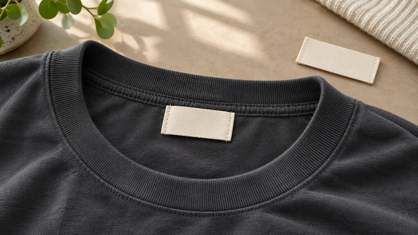
A woven label is a separate piece of fabric. Choose it when you want the label itself to be a visible detail. Look at the finished edges, the fold, and where the stitching lands. A loose swatch cannot show whether a corner lifts or a folded edge rubs at the neckline. Ask to see the label sewn into the actual collar construction before judging it.
A heat-transfer label applies the design directly to the inside of the garment, so there is no sewn tab. Check how the marked area feels when the jersey bends and stretches. Look at the outside of the shirt under angled light for any visible impression or change in sheen around the application area. For either method, review the smallest text at actual size. If a detail is hard to read on the sample, simplify the artwork before approving it.
Give placement a reference point
“Centered inside the neck” leaves room for interpretation. On a flat garment photo, mark the center back and identify the seam from which the position should be measured. For a woven label, say whether you are locating the visible edge, the center of the label, or the edge caught in the seam. Record the finished visible dimensions separately from any fabric hidden in a fold or seam.
For a transfer, draw the boundary of the artwork and give the distance from its top edge to your chosen seam reference. Measure with the shirt laid flat and the neckline relaxed. If the collection has more than one neckline shape, check each construction. A position that looks balanced on a standard crew neck may look crowded on a shirt with a narrower neck opening.
Review the two options on comparable samples
Use the same shirt fabric, color, and collar construction for the first comparison. If the collection includes both light and dark colors, check the preferred option on at least one of each before signing off. When a garment has a wash or dye finish, record when the label is applied relative to that finish. Compare samples prepared using the proposed production sequence.
Lay each sample flat, then put it on and move naturally. Check whether a woven corner catches at the neck and whether a transferred area feels noticeably different from the surrounding jersey. Photograph the inside and outside under the same light. Include a full view of the collar as well as a close-up. The close-up helps you judge edges and lettering, while the wider photo shows whether the position looks balanced.
Check the label again after laundering
Keep an unwashed reference and launder the review sample according to the care process planned for the garment. Record the wash and drying conditions so the comparison can be repeated. Let the shirt dry completely before comparing the collar, label, and surrounding fabric.
On a woven label, look for curling edges, loose stitches, or puckering where it attaches. On a transfer, inspect the edges and fine strokes for lifting, cracking, or loss of clarity. Try the garment on again. A label that looks acceptable on the table can still feel different after laundering. Agree on what changes you can accept and keep reference photos with the sample record.
Turn the approval into a repeatable specification
Save the approved artwork revision, label method, visible dimensions, position reference, and size and color variants together. Include a photo of the finished label in place and record which garment sample was approved. If you choose woven on one style and heat transfer on another, put the decision on each style’s specification sheet.
For a repeat order, pull up that record before reusing the artwork. A different fabric, collar construction, or finish is a reason to check the label on a fresh sample. If you are preparing a custom T-shirt brief for GRAPHFORGE, share the label artwork, fabric and color choices, and a photo showing your preferred position. Those details give the next sample a clear starting point.
Ready to start your production run?
Send us your design, quantity and target delivery date. We will reply with a clear quote and a sample timeline within 48 hours.